什么是折线图
当一个变量随着另一个变量明显变化的时候,比如说它们有一个大的协方差,那最好使用折线图(Line)。通常,折线图可以显示随时间(根据常用比例设置)而变化的连续数据,非常适用于显示在相等时间间隔下数据的一个趋势。而使用散点绘制这些将会极其混乱,难以真正明白其中的规律和趋势。折线图就非常适用于这种情况,提供了两个变量(百分比和时间)的协方差的快速总结。此外,应用中也可以通过对线条进行彩色编码形成分组。
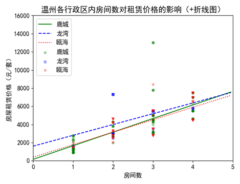
任务4:按行政划区,使用一元线性回归分析方法分析房间个数与房价相关性,并用折线画出分析后的结果。
| def plot_scatter():
plt.figure()
colors = ['red', 'blue', 'green']
district = [u'鹿城', u'龙湾', u'瓯海']
markers = ['o', 's', 'v']
for i in range(3):
x = house.loc[house['district'] == district[i]]['fj']
y = house.loc[house['district'] == district[i]]['price']
plt.scatter(x, y, c=colors[i], s=20, label=district[i], marker=markers[i],alpha=0.3)
#一元线性回归分析与折线
for i in range(3):
x = house.loc[house['district'] == district[i]]['fj']
y = house.loc[house['district'] == district[i]]['price']
house1 = house.loc[house['district'] == district[i]]
regr = linear_model.LinearRegression()
regr.fit(house1[['fj']],house1[['price']])
x = np.arange(0,5,0.05)
y = regr.coef_*x + regr.intercept_
plt.plot(x,y.T,c=colors[i],label=district[i])
plt.legend()
plt.xlim(0, 5)
plt.ylim(0, 16000)
plt.title('温州各行政区内房间数对租赁价格的影响(+折线图)', fontsize=20)
plt.xlabel('房间数', fontsize=16)
plt.ylabel('房屋租赁价格(元/套)', fontsize=16) plt.legend(loc = 2)
plt.show()
plot_scatter() |