一元线性回归模型有一个主要的局限性:它只能把输入数据拟合成直线。而多项式回归模型通过拟合多项式方程来克服这个问题,从而提高模型的准确性。
任务2:根据放映天数,使用多项式回归分析预测电影日均票房。
from sklearn.preprocessing import PolynomialFeatures
x = df[['放映天数']]
y = df[['日均票房/万']]
# 初始化一元线性回归模型
regr = linear_model.LinearRegression()
# 一元线性回归模型拟合
regr.fit(x, y)
# 初始化多项式回归模型
polymodel = linear_model.LinearRegression()
poly = PolynomialFeatures(degree = 3)
xt = poly.fit_transform(x)
# 多项式回归模型拟合
polymodel.fit(xt, y)
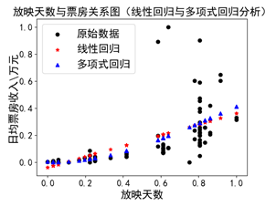
plt.title('放映天数与票房关系图(线性回归与多项式回归分析)')
plt.xlabel('放映天数')
plt.ylabel('日均票房收入\万元')
plt.scatter(x, y, color='black', label = "原始数据")
plt.scatter(x, regr.predict(x), color='red',linewidth=1,label="线性回归", marker = '*')
plt.scatter(x, polymodel.predict(xt), color='blue',linewidth=1,label="多项式回归", marker = '^')
plt.legend(loc=2)
plt.show() |
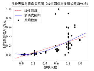
可视化参考代码如下:
| plt.title('放映天数与票房关系图(线性回归与多项式回归分析)')
plt.xlabel('放映天数')
plt.ylabel('日均票房收入\万元')
x_min = x.values.min() - 0.1
x_max = x.values.max() + 0.1
#定义一个一列的数组,最小值是x_min,最大值是x_max,步长是0.005
x_new = np.arange(x_min,x_max,0.005).reshape(-1, 1)
xt_new = poly.fit_transform(x_new)
# 画出原数据
plt.scatter(x, y, color='black', label = "原始数据")
# 一元线性回归模型结果的可视化
plt.scatter(x_new, regr.predict(x_new), color='red', s=2,linewidth=1,label="线性回归")
# 多项式回归模型结果的可视化
plt.scatter(x_new, polymodel.predict(xt_new),s=2, color='blue',linewidth=1,label="多项式回归")
# 在左上角显示图例
plt.legend(loc=2)
plt.show() |
思考进阶(一):修改degree的取值,分析其变化,并说明参数degree的作用。
不同degree的预测结果示例如下图所示。

其中一个子图的代码如下,以此类推。
| poly1 = PolynomialFeatures(degree = 1)
xt1 = poly1.fit_transform(x)
polymodel1 = linear_model.LinearRegression()
polymodel1.fit(xt1, y)
x_new = np.arange(x_min,x_max,0.005).reshape(-1, 1)
xt_new1 = poly1.fit_transform(x_new)
fig = plt.figure()
degree1 = fig.add_subplot(2,2,1)
degree1.scatter(x, y, color='black')
degree1.scatter(x_new, polymodel1.predict(xt_new1), s=2, color='green',linewidth=1)
degree1.set_title('degree = 1')
plt.show() |
思考进阶(一):循环实现。
可以使用循环,精简代码展现四个子图。参考代码如下:
| fig = plt.figure()
for i in range(4):
poly = PolynomialFeatures(degree = i+1)
xt = poly.fit_transform(x)
polymodel = linear_model.LinearRegression()
polymodel.fit(xt, y)
x_new = np.arange(x_min,x_max,0.005).reshape(-1, 1)
xt_new = poly.fit_transform(x_new)
degree = fig.add_subplot(2, 2, i+1)
degree.scatter(x, y, color='black')
degree.scatter(x_new, polymodel.predict(xt_new), s=1, color='blue',linewidth=1)
degree.set_title('degree = ' + str(i+1))
plt.show() |
degree的作用讲解及实现详见以下视频: