7.3.3 Results and discussion
Although participants were told beforehand to choose one leaflet,some of them responded with more than one.The reason was,as they provided,that they liked two and could not decide which one to choose.In this case,the result was coded for both leaflets.That is,both of the leaflets were counted as chosen.Therefore,there will be more votes on the total of five leaflets than the number of participants.Furthermore,when asked about the reason of their votes for a specific leaflet,participants sometimes gave more than one reason.Thus the number of reasons for each leaflet was larger than the number of votes in some cases.
The number of votes each leaflet gets is summarized in Table 7.15.The Longman leaflet received most votes(15)from altogether 40 participants.The HQYS leaflet was the second most popular,with 11 votes.EF leaflet was the third one with 9 votes,RL received 8 votes and WSE received the least votes(6).
Table 7.15 Distribution of votes among the five leaflets

In the following section,we will try to check whether the three conditions are true in the evaluation of the five leaflets.If they are true,the LM leaflet should be the one which best satisfy the conditions,and the hypothesis will be supported accordingly.
7.3.3.1 Global coherence
The evaluation in terms of global coherence is to see the suitability with the discourse topic.Since the content of the verbal elements in the five leaflets all cover a set of similar topics,including the profile of the company,the teachers/employees,the teaching methods,they are,generally speaking,closely related to the English teaching and learning,and they are thus not as distinguishing as the pictures.Therefore,in this section we'll discuss the pictures first,and then the verbal texts.
To obtain an objective rating of the suitability of the pictures with the discourse topic,a small-scale investigation was performed.The pictures of the five leaflets were shown on a Powerpoint file and 11 graduate students at Peking University were asked to judge their suitability in the English learning advertisements on a five-point Lickert scale.The descriptive statistics are shown in Table 7.16 below.
Table 7.16 Descriptive statistics of the ratings on global coherence of the five leaflets

It's shown that the pictures in the LM leaflet have the highest suitability with the discourse topic,thus the highest score in terms of global coherence.The other three leaflets,HQYS,EF and RL,show a correspondence between the picture's global coherence(2.798,2.638 and 2.424 respectively)and their ranking in evaluation by the 40 participants.The only exception is the WSE leaflet which shows a relatively high global coherence given its lowest ranking in readers'evaluation.
The ranking of the rating results of global coherence of the pictures in the five leaflets,in general,is in accordance with their ranking in readers'evaluation.Therefore,we can claim that the global coherence of the pictorial signs in a leaflet with the context may be used as a predictor of the reader's appreciation of the leaflet as a whole.
However,we cannot rush to the conclusion that the assumption about the condition of global coherence is supported without examining the verbal texts.As noted above,the verbal texts in all the leaflets share many common topics in content which suit well with the communicative purpose of these leaflets as promotional materials of profit-making English teaching and training service.
For example,the LM leaflet is composed of 6 parallel sections:Top Brand,Teachers,Teaching Material,Teaching Equipment,Teaching Programs and Guarantee(for learning success).All of them are closely related with the overall topic of the leaflet—English teaching and learning.All the information are highly relevant to the discourse topic and thus attract the interest and trust of the readers as potential customers.Actually,when one participant stated her reason for choosing the LM school,she mentioned the topic of almost all these sections:
用自己出版的教材、自己培养的老师,用互动白板,给很多美国大学像哈佛等编教材,(所以)感觉他的英语应该更标准,更地道。 ——Yaojia
Translation:It publishes its own textbooks,trains its own teachers,uses interactive whiteboard,and edits teaching materials for many American universities,like Harvard.(So I)feel its English should be more standard and authentic. —Yaojia
In contrast,all the other leaflets contain topics that do not belong to the English learning proper,such as promotion incentive,activities for fun.For instance,the WSE leaflet has a section called“certification”which is composed of introduction of three kinds of certificates:ISO9001,a certificate for the correspondence of their courses to the CEFR and a certificate of completion of one of their programs.Although the first certificate of ISO9001 indeed increases the force of their persuasion,evidenced by two votes from the participants based on this reason,some participants explicitly questioned the relevance of this section with the overall topic of the leaflet.
华尔街的(广告)放了好几个证书,感觉也没啥关系啊,不知道干吗的。——Lifeng
Translation:The WSE leaflet includes several certificates.I feel they have not much relevance here(with the discourse topic).Don't know what they are for.
—Lifeng
The EF leaflet and RL leaflet both feature the variety of activities they provide.Specifically,they claim that they provide,besides teaching and learning,many activities for fun and social networking,such as movie playing,club,and holiday celebrations.One of the possible consequences leading to negative evaluation is that the status of teaching and learning is not as highlighted as in the LM leaflet.Another is that these verbal texts about extracurricular activities arouse critical responses in some participants,for example,one participant who voted for LM,commented,
Longman是出版英文教材的权威,其他的都太商业化,感觉像骗人的。(你说的商业化指什么?)像英孚,省6 000元,赠送这个那个,就很商业化。还有,好讨厌那种故意搞得很花哨的,像(RL学校)刻意地说什么体验西方节日,就是以小化大,其实很简单的东西,故意搞得很复杂。最讨厌播电影,我自己在家播就可以,干吗上你这。
——Xuqili
Translation:Longman is the authority in publishing English teaching materials.Others are too commercialized,and seem like tricky and lying.(What do you mean by commercializing?)Like EF,it says“save 6,000 yuan”,and free this,free that,very commercialized.Moreover,I dislike those which deliberately make themselves look fancy,like RL,saying deliberately“experience Western holidays”is making trivial into big.It is actually very simple,but they deliberately make it seem complicated.I hate most“playing movies”:I can play movies myself at home,why do I come here? —Xuqili
These negative responses indicate that the participants are rational consumers who know exactly what they are looking for in these English training programs.The content represented in the verbal texts in these leaflets which is not closely related to teaching and learning is regarded as unrelated,or at least,less related,to their goal of consumption.Since the leaflets,as a type of promotional materials,should try to appeal to people's goals and desires,it is natural that the information which bears weak relation with the discourse topic—English learning,undermines the evaluation of the leaflet by readers.
7.3.3.2 Local coherence
In this section,we'll analyze the semantic connection between verbal and visual elements in the five leaflets.As discussed in Section 5.2,the patterns of visual-verbal relations are very different in the Reader Attraction and other sections of the English learning leaflets,so the analysis here will also be organized in two parts.We'll first compare visual-verbal relation in the Reader Attraction among the five leaflets,and then that in other stages.
In the LM leaflet,the picture on the cover shows two female students with books walking on a campus.Under it the verbal slogan reads“live and learn”.The information linking between the picture and the verbal slogan is realized through the information unit“students”in the picture and information unit“learn”in the verbal.According to the framework proposed in Section 5.3.1,this information linking should belong to the“associational”type since“students”and“learn”have very high frequency of occurring in the same semantic field.In contrast,the verbal-pictorial information linking in the other four leaflets show different patterns.In the RL and HQYS leaflets the type of verbal-pictorial information linking is“cross-cutting”because the picture and the verbal slogan are directly overlapping or crossing on one information unit.In the EF leaflet it is“juxtaposition”because the picture in which a white male and a Chinese young woman tied together by ropes has no obvious link in conceptual information with the verbal slogan“24小时私人英语教练”(24-hour private English coach).Therefore the local coherence needs to be actively constructed by the reader.The cover of the WSE leaflet highlights a gold key with many teeth which is put against a key hole on a door.The verbal slogan says“华尔街英语多元法独创的学习系统开启您成功之门”.The verbal slogan and the picture are connected by two links,for example,the“多”in the verbal and the number of teeth on the key is one,the image of key in the picture and the“开启……门”in the verbal are also two information units that are regularly collocated.Therefore it is labeled as“multiple links”.The result of the evaluation task here indicates that the“association”type of linking is best appreciated by readers than other types.This result is in accordance with that of the evaluation task in Meng(2010).
Meng(2010)studied the question of what kind of verbal-pictorial relation was best appreciated by readers through a questionnaire survey with 64 undergraduates(31 male,28 female and 5 sex information missing)at Peking University.They were shown with 13 pages of the Reader Attraction of these English learning leaflets and required to rate on a five-point Lickert scale in the light of two evaluation items—attractiveness and trustworthiness.The statistics obtained show that the ratings of the“association”type are significantly higher than those of other types of information linking.The result is explained in the light of“cognitive pleasure”in psychology which holds that the tasks that acquire maximum appreciation should require some cognitive effort but can be finally resolved.The effect of cognitive pleasure can find support in many other studies.For instance,MaQuarrie and Mick(1999)find,“texts that allow multiple readings or interpretations are inherently pleasurable to readers.Texts that are simple or onedimensional are less likely to be sources of pleasure.Similarly,texts that are opaque or too difficult to decipher also fail to give pleasure.It is texts that resist simple readings while showing the way to more complex readings that are most likely to give pleasure to readers”.In the case of the English learning advertisements,the indirect linking between the verbal and the pictorial may stimulate the reader to search for the possible connections between them and also comprehension of the page as a whole,and they will experience cognitive pleasure when comprehension is successfully arrived at.
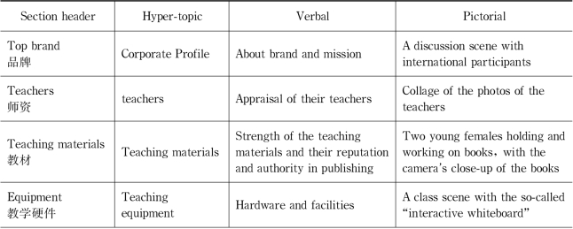
After analyzing the local coherence in the RA,the visual-verbal relations in other stages of these leaflets will also be compared.In the LM leaflet,there is a picture/graph in each component stage,that is,a total of 6 pictures.The content represented in these pictures and verbal texts in the six sections are briefly summarized in Table 7.17.
Table 7.17 Verbal and visual content in the LM leaflet

(to be continued)

We can see that the section headers of the sections,the verbal texts and the pictures show relatively strong semantic connection,or information linking.Except that the picture and verbal texts in the section“top brand”do not have observable semantic connection,all the other five pictures show information connection with their adjacent verbal texts.Specifically,the information that form verbal-pictorial link in the four sections apart from the“teaching programs”are:the teachers in the verbal introduction and the collage of photos in the section“teachers”,the teaching materials in the verbal and the prominent thick books in the picture in the section“teaching material”,the introduction of whiteboard and hardware and the whiteboard in the picture in the section“equipment”,the verbal promise and the gesture of promising in the picture in the“guarantee”section.The section“teaching programs”is special because the pictorial element in it is a composite graph(see Figure 7.15).It is composed of a picture of two students in the centre and a chart flow around it.The chart flow has four steps,iTeach,iStudy,iTalk and iClub.They are the headlines of the four paragraphs in the verbal texts in this section.That is,the verbal texts are centered around and structured on the four steps in the same order as that in the flow chart.The verbal phrases of the four steps are key information in both verbal and pictorial systems and serve as cross-references.Therefore,in summary,the semantic connection between the verbal and the pictorial in various stages of the LM leaflet is very strong.

Figure 7.17 An irrelevant picture in RL leaflet
Compared to the LM leaflet,other leaflets do not have such neat correspondence between the verbal and pictorial elements in smaller discourse units.For example,the picture below(see Figure 7.17)is excerpted from the RL leaflet.It shows a total of five people who are supposed to be the teachers employed by the company.They stand with their arms folded looking into the readers at the eye-level camera angle.The picture might be intended to be interpreted as the teaching team working for the RL company.However,there are no verbal texts about the introduction of their teaching team in this leaflet.If another bigsize picture of many teachers holding their heads upwards and looking up on the leaflet can be interpreted as the attempt to build connection with the“360 degree and complete angle”in their alleged teaching method,this picture,in contrast,cannot be matched with any verbal text semantically.

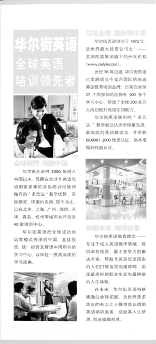
Figure 7.18 Corporate Profile in the WSE leaflet
Another example for the lack of semantic connection between the verbal and pictorial is the following page of the WSE leaflet(see Figure 7.18).The content of the page is about the corporate profile.It consists three sections,marked by three verbal chunks with headlines and three pictures.The verbal chunk entitled“立足全球 国际级水准”on the top is about the brand and reputation of the company,the one entitled“全球视野 领跑中国”in the middle is about its development in China,and the one entitled“放眼未来 璀璨前景”at the bottom is about their mission.The three pictures represent instruction scene,office building and class scene respectively.Although the pictures suit well with the discourse topic—English teaching,they do not have obvious semantic correspondence with the three verbal chunks.This makes it difficult to find a clear attribution of them to the three sections.That is,although the three verbal chunks obviously mark the boundary of three sections of the Corporate Profile stage,it's difficult to decide which picture goes with which section.The lack of information linking between the pictures and the verbal texts leads to the ambiguity in structure,which might be a reason for its low evaluation by readers.
Therefore,to summarize,the LM leaflet is a very good sample of semantic connection between the verbal and the pictorial,which contributes,at least partly,to its high appreciation by readers.
7.3.3.3 Surface cohesion
In this section,structural cues,color and typographical features in the five leaflets will be compared.
The LM leaflet(see Figure 6.7 for the inside pages)uses several types of devices to mark the structure of the whole discourse.For example,the use of the same visual format in the headings of all its sections—a yellow square icon and an arc line on which the header is placed.Visual similarity is also embodied in the composition of each of the main stages:each stage includes a heading,a verbal paragraph and a picture.Moreover,the use of color—yellow and blue as the design color is consistent for each section and the whole page.White is the background/canvas color.There is no negative comment on the layout design of the LM leaflet from the participants.
The RL leaflet(see Figure 7.14 for the inside pages)has an irregular design in the layout.That is,the visual space is divided into several main irregular zones in which different visual formats are used.The designer uses especially the manipulation of size to highlight the information he/she intends to.The consequence is that there is no clear parallel or hierarchical visual structure in the whole leaflet.
The HQYS leaflet(see Figure 7.13 for the inside pages)uses the cohesive devices in layout comprehensively.Firstly,all the pages of the leaflet are represented on a blue background/canvas color.The consistency in color provides cohesion between these pages.Secondly,it also has salient section headings with visual similarity.Another structural cue in it is the parallel structure in the presentation of information in each of the major sections,especially the use of table format,either with overt or concealed framing.For example,the second page,the third page and even the fourth page could be seen as formatted as a table.This consistency makes the visual structure very clear.
The EF leaflet has a clearly structured layout,especially on the second page.The second page(see Figure 6.6)is obviously arranged as six parallel areas,each consisting of a picture and a verbal paragraph.The background/canvas color of the leaflet is white,so it looks very clean and readable.The third page(see Figure 7.12)has a hierarchical structure,with a large print headline on the top,and in bright color.Three secondary level headings are marked with numbers and the components are also similar.A separate verbal listing in small print is put at the right bottom of the page.At the most bottom margin is the contact information which is not regarded as a focus of attention in this book.The fourth(last)page,which is not reproduced here,shows a map of the subway lines in Beijing on which all the teaching centers of the EF company are marked.However,there is no continuity of color between the different pages since the cover page is shown against a bright pink background.
The WSE leaflet(see Figure 6.8 for the inside pages)also uses many structural cues,such as consistency in color,headings and typographical features,in order to create a clear and regular visual structure.However,many participants found the WSE leaflet not attractive because its color is not eye-friendly.What needs to be noted is that the main color used in this leaflet is golden,perhaps with the purpose to maintain consistency with the key information“gold key”in the cover.The color is OK on the original paper version,however,when moved onto the computer screen,it looks radiant and shiny.That makes it difficult for the eyes to read.
The comparison of the layout design among the five leaflets shows that the LM leaflet and the HQYS leaflet show comprehensive use of the cohesive devices to achieve the effect of a clear,balanced and consistent visual layout.As a participant comments on the LM leaflet:
设计规矩,空间布局上和色彩搭配上很舒服。
——Lanhaifan
Translation:The design is reasonable.Spatial arrangement and color combination also look comfortable.
—Lanhaifan
7.3.3.4 Summary
The comparative analysis of the five leaflets in terms of all the three levels of coherence construction,namely global coherence,local coherence and surface cohesion,reveals that the LM leaflet meets the three conditions to the largest extent.Thus the predictions in Section 7.3.2 are supported.
What needs to be noted is that,due to the theoretical assumptions held in this book,some factors that might also contribute to the evaluation results might be left out.For example,the emotional factor might also matter.One participant compares the LM leaflet and the RL leaflet,saying,
LM的广告很亲切。用了很多人,人的脸、长相很亲切。瑞来上面的人看起来不亲切。
——Wangxiaolin
Translation:The leaflet of LM seems closer emotionally.They show many people(models)whose faces and appearance make you feel close and amiable.The people on the RL leaflet are not. —Wangxiaolin
Actually,as this participant sharply detects,the emotional responses elicited by pictures are not open to conscious critical thinking.On the other hand,eliciting emotion is one important function of pictures,as many researchers have acknowledged(see for example,Messaris,1997).Therefore,the reasons for the evaluation results might not be as straightforward as suggested in the above analysis which is structured around the three levels of coherence construction;instead,it is the final product of the trade-off between complex factors.
However,the fact that no result can be neatly attributed to only one cause and we can never be absolutely sure about the reasons should not hinder our exploration into the truth.The comparative analysis of the five leaflets in terms of the three levels of coherence construction can indeed account for the evaluation results and verify our theoretical assumptions.This result is encouraging for us to continue to do research in this regard in the future.


