6.3.1 Layout structure
In the English learning advertisements,it is found that the visual similarity and framing are two devices for marking off the layout chunks as parallel discourse segments or units,whereas the spatial nearness is more often used inside these discourse units as a device signaling the existence of relation between the elements involved.In other words,visual similarity and framing are often used to cue macro-structure and thus facilitate the reader's construction of global coherence.Spatial nearness,on the other hand,is more often used to show the connection of two or more elements inside a discourse segment.In this sense,it is a formal device for the building of local coherence.But it can also indirectly have the visual effect of demarcating the layout by grouping elements into clusters.In all,visual similarity and framing will be discussed first as devices for cueing the macro-structure of the discourse,followed by the discussion of spatial nearness as a cohesive device inside smaller discourse segments.
What needs to be noted in passing is that the layout structure and rhetorical structure of the discourse are two different layers of multimodal analysis.The layout structure is the materialization of the rhetorical structure of the discourse on the page or electronic screen.Although they are mapped onto each other to a great extent in most cases due to the universal perceptual principles guiding the design process,it is not necessarily so.Bateman(2008)includes an analysis of such a case in which the layout structure is slightly incongruent with the rhetorical structure of the discourse.It is in these incongruent cases that the effect of the formal cohesive devices is shown to their maximum.That is,when the layout structure meets constraints from the affordances,for example,the size of the paper or screen,the formal cohesive devices for signaling structure,for example,visual similarity,can come to rescue in order to ensure the realization of the rhetorical structure.
In the multi-paged leaflets which contain a complex hierarchy of elements subsumed in sections and sub-sections,the marking of the structural units often involves more than one device at the same time,rather than by a single one at a time.For the convenience of clarification and exemplification,the strategies will be described one by one and after this a comprehensive summary will be given.
6.3.1.1 Visual similarity
Visual similarity can help create visual patterns that give readers a quick map of the document by identifying the key units and subunits,and create cohesion among the units and subunits by bonding them visually.Through the similarity in color,type face and size,shape,composition,etc.,the document can be visually grouped into units under a higher order unit.
In the English learning advertisements,the visual similarity is often embodied by the feature that the several sections with parallel status are composed of the similar set of components,for example,each section is composed of a picture on the top and a verbal sentence below it.The similarity in composition,color,shape,and other layout features signals equality in status of the several visual chunks and tends to be perceived by the reader as such.
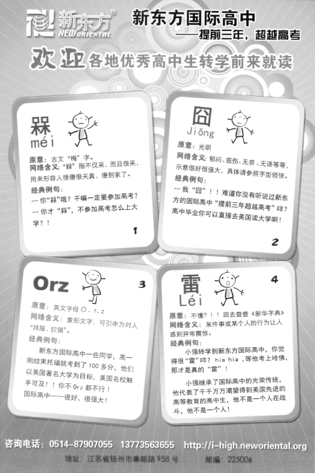
Figure 6.2 is an example of visual similarity.It is organized around four visual chunks with similar color,shape,and organization of elements.More specifically,all the four chunks take on the format of lexical entries in dictionaries,framed in white-ground squares.The use of color is also consistent across the four visual chunks—orange for key words and black for other verbal texts.Each includes a drawing of a person with slight variations at the central top of the square.The visual similarity groups the advertisement page into four parallel units visually.In this way it creates cohesion among the four units.
Of course,the content in the four squares plays a decisive role in their parallel status;however,the visual similarity,as a formal device,enhances this structuring effect.It gives readers clear signals to identify the intended rhetorical structure quickly and efficiently.

Figure 6.2 A special example of visual similarity as structural marker
Compared to the example in Figure 6.2 which is somewhat original,the example below(see Figure 6.3)represents more typical design in the English learning leaflets and brochures.It is excerpted from a brochure.The main content is introduction of the courses this English language school provides.It is shown that the page is organized into five visually similar rectangular composites incorporating verbal texts and pictures apart from the image of a woman at the right bottom corner of the page.The five rectangles are visually formed by five different colors on which the verbal texts and pictures are printed.They are concerned with the five series of courses provided in this English language school and share similar composition and format.That is,each is composed of a verbal heading,a bullet list of verbal clauses on the left and a picture on the right.The space the verbal text and the picture take in each of the five rectangles are also similar.Therefore,the visual similarity across the five rectangular chunks marks the parallel status of them as sections under the topic of the page—course information.The difference in background color implies the individuality of each section in relation to others.

Figure 6.3 A typical example of visual similarity
6.3.1.2 Framing
By framing,the presence of dividing devices disconnects elements of the image or page,cueing that they belong to different functional units of the discourse.It includes the“framing”resources in Kress and van Leeuwen(1996)and extrinsic features in Bateman(2008)and the resources in“spatial”category in Kostelnick and Roberts(1998).The frequently employed resources include dividing lines,frame lines and white space.
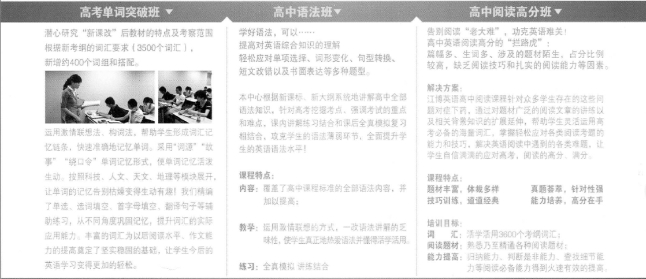
Figure 6.4 below is an example of the framing achieved through dividing lines.It is excerpted from a flyer and also concerned with the course information.Two dividing lines divide the visual field into three sections.There are altogether three courses shown in this example marked by three verbal headings on the top:“高考单词突破班”“高中语法班”and“高中阅读高分班”.Although the three sections do not share similar formats,the dividing lines serve as explicit markers of the structural boundary.Therefore,they are the key cohesive devices that group the semiotic elements on this page into a coherent and organized discourse unit.

Figure 6.4 An example of framing
As mentioned earlier,the various cohesive devices often work simultaneously in actual cases.In this sense,Figure 6.2 can also be regarded as an example for framing because the four visually similar chunks are framed in squares.
6.3.1.3 Spatial nearness
According to the Gestalt theory,if two or more elements are placed together in a visual space,they tend to be perceived as related to each other and constitute a larger unit in the reader's mental model.As Brasseur(2003:83)finds,if the text is placed close to the diagram,such as within boxed frames that include both the graphic and text,it is more likely to be read and understood.Likewise,if two semiotic elements are placed together,they are intended to be read in relation with each other.
For example,in Figure 6.3 shown above,the picture of a foreign woman is placed in proximity to the five rectangular composites introducing course information.Clearly it is different from the rectangles due to the sharp difference in both form and content.However,when it is placed near them,the readers will try to perceive them as connected elements inside a discourse unit.The woman will be most probably thought of as one of the foreign teachers that are emphasized in each of the five course series.In other words,the image of the foreign woman is intended to boost the reliability of their verbal claims.
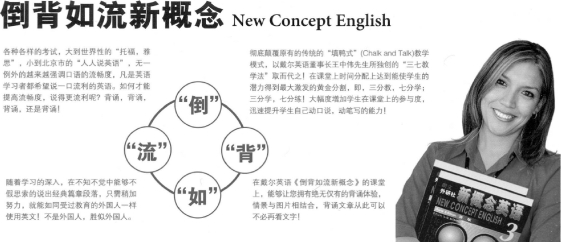
The following excerpt(see Figure 6.5)from a leaflet is another example of the use of spatial nearness as cohesive device.Under the big-size heading“倒背如流新概念New Concept English”,there are four chunks of verbal texts separated by white space,all of which boosting the reciting strategy used in this specific course.In the centre of the four verbal chunks is a diagram showing the expression“倒背如流”.On the right of the page,there is a picture of a foreign woman with books in her hands.The spatial positioning of the picture of the woman in proximity with the verbal texts signals that they are intended to be related to each other and belong to the same discourse unit.Similar to that in Figure 6.3,the image of the woman is most probably used as a representative of the foreign teachers employed by the specific English language school.Actually the connection between the picture of the woman on the right and other elements in the verbal and the figure on the left is further enhanced by the title of the books in her hands—New Concept English—which repeats the key information in the verbal texts.

Figure 6.5 An example of spatial nearness
The above analysis shows that the visual similarity,and framing are cohesive devices that help readers sort through and structure information into groups and subgroups.The spatial nearness is a device that glues certain elements together to form a discourse unit.They are the ways that create structure in the page.As Kostelnik and Roberts(1998)argue,“When we look at a visual field—either a printed page or a computer screen—we immediately search for clues about its structure.Visually defined groups usually satisfy that need,whether the field contains texts,pictures,or data displays—or a combination of textual and nontextual elements”(Kostelnik and Roberts,1998:63-64).Therefore,these devices are important for the reader's perception of the macro-structure of the discourses and subsequently,the comprehension of the meaning of the discourse.
After illustration of the three grouping principles in layout structure analysis,it should be stressed again that in actual cases these resources are often used simultaneously and together with other resources that are more verbal,like heading.A sample analysis of the comprehensive use of the resources is given in the following figure(see Figure 6.6).

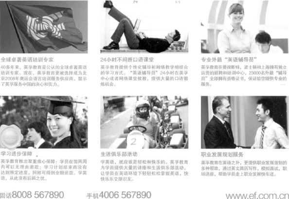
Figure 6.6 An example of the comprehensive use of structural markers
Figure 6.6 has clearly six component parts except the contact information on the bottom margin.This layout structure marks the rhetorical structure of the page,that is,the page is composed of six functional sections.This effect is achieved by the use of many cohesive devices simultaneously.In the respect of visual similarity,each part consists of a picture on the top and a verbal paragraph below it.In each of the verbal paragraphs there is a phrase as heading above the paragraph.Thus they have the same composition.The six pictures are of the same size and the verbal texts are all in blue color and occupy the same areas of space.Thus it is obvious that the six visual groups have similar forms.In the respect of spatial nearness,each picture is placed nearer to the verbal text below it than to other chunks of verbal text.Moreover,each chunk of verbal text is placed nearer to the picture above than to the picture below.Therefore,visually the picture and the verbal text below constitute a relatively intact section.In the respect of framing,the six sections are separated by white space.That is,the space between sections is larger than that between picture and the corresponding verbal text inside the section.In a word,all these visual resources contribute to the visual effect that the six chunks have equal status in the whole page and each concerns a different aspect of an overarching topic—here the English training company concerned.
Derived from Gestalt principles,these devices are virtually universal—that is,most readers will have similar perceptual responses to visual language that displays these principles(Kostelnik and Roberts,1998:53).Therefore,although the analysis is mainly based on the English learning advertisements as a specific multimodal genre,the proposal of these cohesive devices can hopefully apply to other multimodal genres as well.