This is an attempt to visually explain the core concepts of the Central Limit Theorem. By providing a variety of interactive components, this page seeks to provide an intuitive understanding of one of the foundational theories behind inferential statistics. It draws inspiration from other visual explanations, such as this one on decision trees and these wonderful projects from setosa.io. The code is on GitHub.
Importantly, this is not a robust explanation of the theory. If you have any feedback (about the explanation, implementation, or design), feel free to reach out on on twitter.
A Simple Starting Point
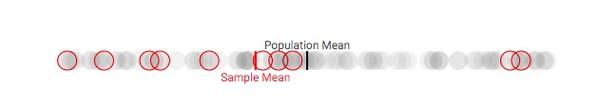
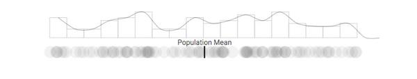
In order to grapple with such an important theory, we'll consider a simple hypothetical situation. Let's imagine that there's a populaiton of 100 people with a distribution of opinions that range from, say, 0 - 100 on some issue. Its simple to consider those views represented along a horizontal axis as follows, with the mean opinion of that population labeled and shown as a dark line:
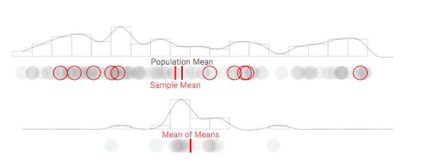
As a social scientist, you may be interested in measuring the disposition of this population, and describing it using information such as the mean opinion. Unfortunately, you may not have the time or funding to ask each individual their opinion. So, you may have to sample from the population at hand. Let's say you had enough time/effort to randomly sample ten individuals from your population of 100. This would give you some idea of how the population stands on the particular issue:
As you can see, a sample mean can differ a substantial amount from our population mean. So, how could sampling ever be reliable...?
Consider Multiple Samples
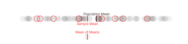
So let's say, hypothetically, that we could take multiple samples from our population. While this is something that may happen (especially with political polls), we'll use this more as an explanatory tool (there are other considerations that come into play when you actually sample repeated times that we won't consider). For each sample, let's keep track of how the sample meancompares to our population mean each time we draw a sample. Once we repeat the process multiple times, we will have a distribution of sample means, often referred to as the sampling distribution of the mean or (more simply) the sampling distribution. We'll display the distribution of sample means in a density plot below our population's density plot:
As we repeat this process, you may notice something interesting happen: the difference between our true population mean and the mean of our sample means begins to shrink. This makes sense, as it feels similar to simply drawing a larger sample (with replacement) from our population. Unfortunately, this doesn't solve the problem of limited resources for understanding a population's position on a particular issue. In order to understand the quality of a single estimate, we first need to understand what the distribution of sample means looks like.
Thinking about Distributions
The current visualization of our population's opinions as a density plot is a bit hard to decipher, so let's add a bit more information with a histogram of the opinions. This will better allow us to see the shape of the distribution:
Clearly, the distribution of our data is not normal. While many natually occuring phenomenon happen to be normally distributed, many are not. Luckily, the Central Limit Theorem provides us with a strong foundation for discussing the estimation of population parameters regardless of whether or not the event is normally distributed.
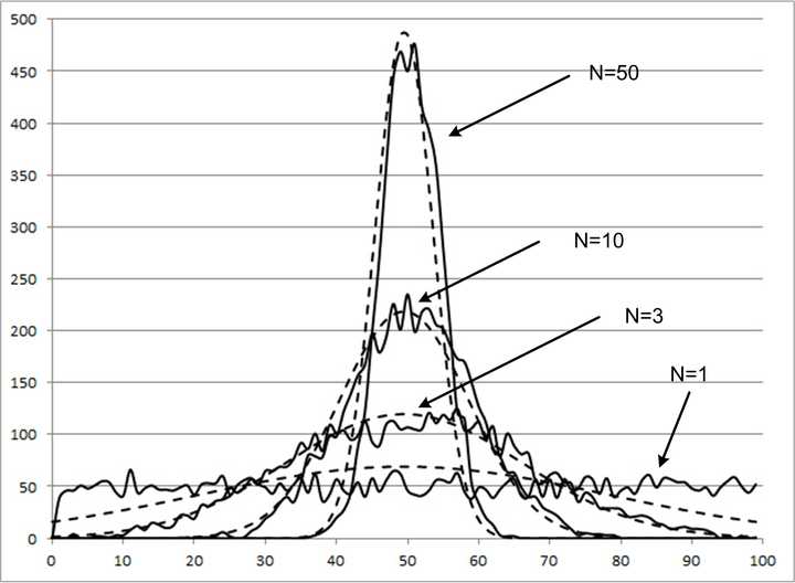
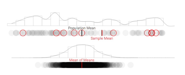
As it turns out, the shape of the population's distribution isn't what will help us understand our ability to make inferences about the population. Instead, let's consider what the distribution of sample means (also known as the sampling distribution) looks like. Use the button below to take multiple repeated samples, and see how the sampling distribution begins to take form.
This is a bit tedious, so let's speed the process up a bit:
As the number of samples taken increases, the sampling distribution becomes normal. This holds true regardless of whether or not the true population parameter is normally distributed. As noted above, the sampling mean (the mean of the sampling distribution) becomes increasingly accurate as the number of repetitions increases.
Why it matters
As the number of samples taken approaches infinity, the distribution of our sample means approximates the normal distribution. This foundational theory in statistics is what allows us to make inferences about populations based on an individual sample. Given our understanding of the normal distribution, we can easily discuss the probability of a value occuring given a mean. Conversely, we can then estimate the probability of a population mean given an observed sample mean. This not only allows us to provide reliable estimates of population values, but empowers us to quantify the confidence in our estimates (more on this in a future post).
Hopefully this explanation provided some intution to a generic defintion, such as this one from Wikipedia:
The central limit theorem (CLT) states that, given certain conditions, the arithmetic mean of a sufficiently large number of iterates of independent random variables, each with a well-defined (finite) expected value and finite variance, will be approximately normally distributed, regardless of the underlying distribution.