什么是Ant Design Vue?
Ant Design Vue是一个优秀的前端UI组件库,由蚂蚁金服体验技术部推出,于2018年3月正式开源,受到众多前端开发者及企业的喜爱。Ant Design Vue基于Vue实现,专门服务于企业级后台产品,支持主流浏览器和服务器端渲染。
使用npm或yarn包管理工具安装Ant Design Vue。
# 使用npm包管理工具安装
npm install ant-design-vue --save
# 使用yarn包管理工具安装
yarn add ant-design-vue@3.2.14 --save
在src\main.js文件中,导入并挂载Ant Design Vue模块。
import { createApp } from 'vue'
import './style.css'
import AntDesignVue from 'ant-design-vue'
import 'ant-design-vue/dist/antd.css'
import App from './App.vue'
const app = createApp(App)
app.use(AntDesignVue)
app.mount('#app')
1. Button组件
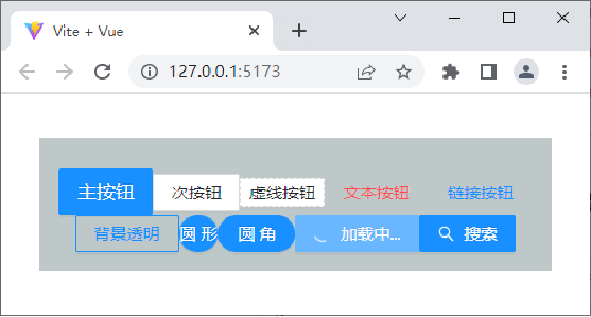
Button组件使用<a-button>标签定义,<a-button>标签的常用属性如下表所示。
属性名 | 属性值 | 描述 |
type | primary | 主按钮,一个操作区域只能有一个主按钮 |
default(默认值) | 次按钮 |
dashed | 虚线按钮,常用于添加操作 |
text | 文本按钮 |
link | 链接按钮,一般用于链接,即导航到某位置 |
disabled | true或false | 是否设置按钮禁用,默认值为false |
ghost | true或false | 是否设置按钮背景透明,默认值为false |
danger | true或false | 是否设置为危险按钮,默认值为false |
shape | default(默认值) | 正方形按钮 |
circle | 圆形按钮 |
round | 圆角按钮 |
size | large | 大尺寸按钮 |
middle(默认值) | 中尺寸按钮 |
small | 小尺寸按钮 |
danger | true或false | 是否设置为危险按钮,默认值为false |
loading | true或false | 是否设置按钮为加载状态,默认值为false |
演示基础的按钮效果
<template>
  <div :style="{ background: 'rgb(190, 200, 200)', padding: '26px 16px 16px' }">
    <a-button type="primary" size="large">主按钮</a-button>
    <!-- 此处省略了8个<a-button></a-button>标签 -->
    <a-button type="primary">
      <template #icon><SearchOutlined /></template>
      搜索
    </a-button>
  </div>
</template>
2. Layout组件
大多数的后台管理系统都涉及到Layout组件的应用。
Ant Design Vue组件库提供了Layout组件,该组件采用Flex(弹性)布局,用于对页面进行整体布局。
Layout组件使用<a-layout>标签定义,其中,<a-layout-header>标签用于定义顶部布局,<a-layout-content>标签用于定义内容部分布局,<a-layout-footer>标签用于定义底部布局。
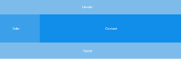
Layout组件中可以嵌套Header(顶部布局)、Sider(侧边栏)、Content(内容部分)和Footer(底部布局)。除此之外,也可以嵌套Layout本身。常见的布局方式包括上-左右-下布局、上-中-下布局、左-上-中-下布局。
下面以上-左右-下布局为例,演示其布局效果。
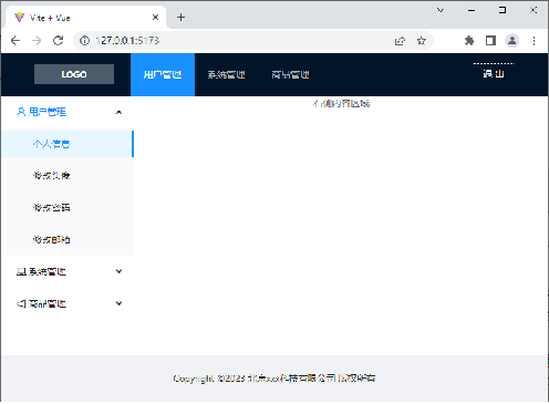
通过实际操作实现后台管理主页面,在这里将内容重点放在布局的实现上,不再详细介绍样式的设计,后台管理主页面效果如下图所示。