
Describing a graph/chart
When asked to accurately write about the information shown in a table(表格),a line graph(曲线图),a bar graph (柱形图)or a pie chart(饼图),you need to describe and compare graphics using numbers and percentages and using more advanced and varied structures and vocabulary. For most students, it’s a rather challenging task. Keep the following tips in mind and learn some structures and words that you don’t know so you can expand your range.
1. In the initial paragraph, you need to paraphrase the question. Start to paraphrase with one of the following prompts.
The table shows/illustrates the trends in... between. The graph shows...
The chart shows how the... have changed...
Then write an overview as your second sentence of your introduction. Look at the beginning and the end of the chart/graph to help determine your overview.
2. Describe the most general trends in the second paragraph, including the most striking characteristics.
Writing a full description of all the information is not often what you are asked to do. Don't describe all small details as this creates lists which sound mechanical. Instead of writing: lt went up by...and then dropped up to..., then rose again for...years, and again dropped by...Write: It fluctuated between... and...for... Remember you need to focus on main trends a elements within each part of the graph/chart.
3. A conclusion makes the writing seem more complete. However, it's also very important avoid adding personal opinions and extra information. State the facts and only the facts!
4. Varied structures and vocabulary are very important.
Change noun and adjective phrases into verbs and adverbs to create a range of expressions, for example “a slight increase” to “increase slightly.” Try to learn a few different ways to say the same thing so you don't have repeat yourself (“increase”, “go up”, “rise”). Also, you need to add linkers such as “in addition”, “furthermore”, “however”, “although”...to help your essay with its cohesion an coherence.
Sample 1
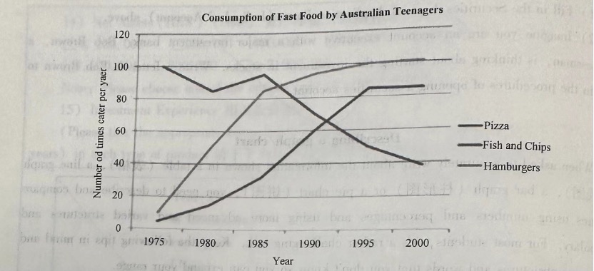
The line graph compares the fast food consumption of teenagers in Australia between 1975 and 2000, a period of 25 years. Overall, the consumption of fish and chips declined over the period, whereas the amount of pizza and hamburgers that were eaten increased.
In 1975, the most popular fast food with Australian teenagers was fish and chips, being eaten100 times a year. This was far higher than pizza and hamburgers, which were consumed approximately 5 times a year. However, apart from a brief rise again from 1980 to 1985, the consumption of fish and chips gradually declined over the 25 year timescale to finish at just under 40.
In sharp contrast to this, teenagers ate the other two fast foods at much higher levels. Pizza consumption increased gradually until it overtook the consumption of fish and chips in 1990.It then levelled off from 1995 to 2000. The biggest rise was seen in hamburgers as the occasions they were eaten increased sharply throughout the 1970’s and 1980’s,exceeding that of fish and chips in 1985 It finished at the same level that fish and chips began, with consumption at 100 times a year.

