
Writing Skill: Describing Charts, Graphs and Diagrams
Data can be represented in many ways, including graphs.The 4 main types of graphs are a bar graph or bar chart, line graph, pie chart, and diagram.
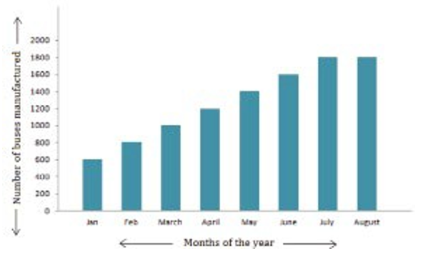
Bar graphs are used to show relationships between different data series that are independent of each other. In this case, the height or length of the bar indicates the measured value or frequency. You can see the example of a bar graph on the right, which is the most common visual for presenting statistical data.
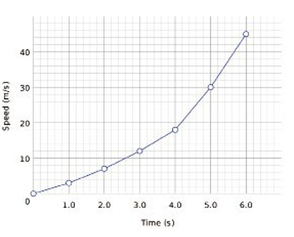
Line graphs represent how data has changed over time. This type of chart is especially useful when you want to record trends or numbers that are connected, such as how sales vary within one year. The right graph is an example.
Pie charts are designed to visualise how a whole is divided into various parts. Each segment of the pie constitutes a particular category within the total dataset. In this way, it represents a percentage distribution. The following is an example.

A diagram is a plan, drawing, or outline created to illustrate how separate parts work and overlap at the connecting points. The following is an example.
Generally, the following phrases are used to explain the main idea or purpose of a chart and graph:
According to the graph, ... As the chart shows, ...
As we can see from the chart, ...
And these words and phrases are used to provide details that supportthe main idea: Rise to/by, increase to/by, double, triple...
Decline, decrease, drop, fall, reach a low point of... Remainstable, stay the same...
e.g. As the graph shows, international students will riseto $100 million by 2020. As the chart shows, sales of computerwill be roughly doubled in 3 years. According to the graph, immigrants fell by 10% over two years.
The following passage is a sample to describe a chart. Read it carefully, and underline the words, phrases and sentences describing the main idea and details.
The chart illustrates the number of men and women studying engineering at Australian universities between the years 1998 and 2018 at 10-year intervals.
It can be seen that the number of male students fell slightly from 14,000 in1998 to 12,000 in 2018, and then remained level through the following decade. The number of female students is relatively low, starting at 2,000 in 1998. However, while the number of men decreased, the number of women increased. The number of female students grew steadily by 2,000 each decade. This led to a rise in the total number of engineering students from 16,000 to 18,000 in this period. Men continued to make up the majority of students. However, the proportion of female students increased sharply in this period. In 1998 there was one woman to every seven men, but by 2012 this had narrowed to one woman to every two men.
Overall, we can see a clear upward trend in the number of female engineering students in Australian universities, while the number of male students seems to have leveled off.
Writing Task
You are going to write a paragraph discussing what the chart shows, paying particular attention to the top portion of the chart, and the bottom portion of the chart.
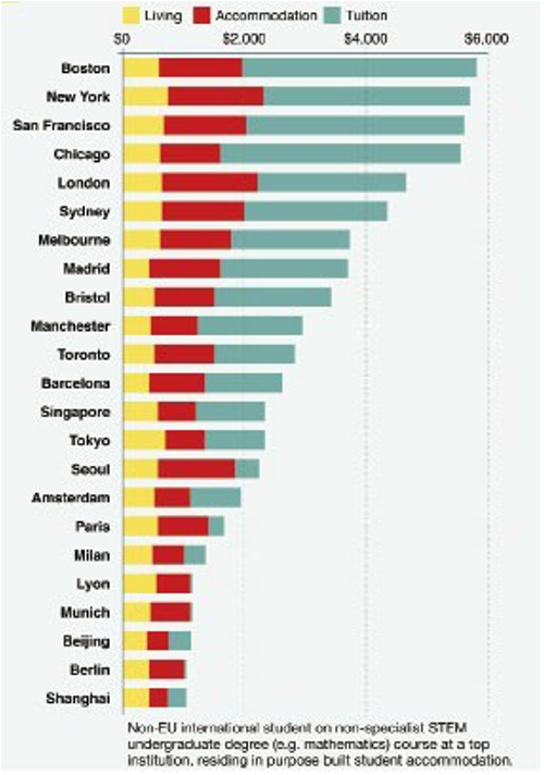
FIGURE Monthly cost of international student living and study
Step 1 Brainstorming for ideas
Note two or more ideas and then share them with a partner.
Step 2 Planning
Follow the outline to make notes for your paragraph. Don't write complete sentences.
Outline
What is the main idea of the graph?
Total cost of living for international university students
What is one detail that supports the main idea of the graph?
Each bar is split between cost of living, cost of accommodation, and cost of tuition
What is a second detail that supports the main idea of the graph?
Of the cities included in the study, the top four are all in the U.S.
What is a third detail that supports the main idea of the graph?
The cost of international study in Mainland European and East Asian cities is generally much cheaper than in the U.S.
Concluding sentence: The cost of international student living varies greatly between countries.
Step 3 Use the notes in the outline to write the first draft of your paragraph. Practice the writing skill you have learned above.
Step 4 Now edit your draft, and correct the mistakes.

