表格(table) 实例1
我们先来看看怎样介绍前面的咖啡和看蕉销售量的表格,以介绍香蕉销售量的第二个table为例:
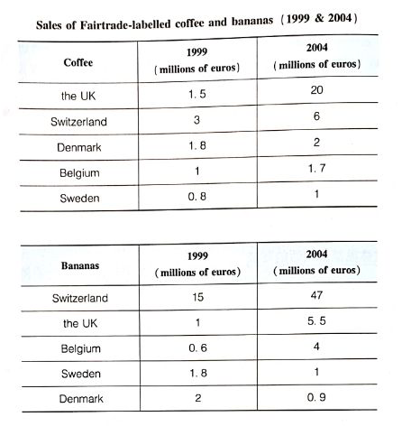
We can see from the second table that Switzerland bought far more bananas than the other four countries (本段的第1旬选择概括哪一类数据明显多于其它的各类数据). (开始进入数据细节的“X句") Swiss sales figures rose sharply from 15 to 47 million euros across these five years, while (体现比较意迟) in the UK and Belgium sales only grew from 1 to5.5 million euros and from 0. 6 to 4 million euros respectively. Sweden and Denmark showed a different pattern (比较意识:呈现出不同的特征), with falls in banana sales from 1. 8 million euros to 1 million euros and 2 million euros to 0.9 million euros. (介绍数据细节的“X句"对5个国家的数据严格按照增长得最多、增长得比较少、减少的顺序排序介绍,不仅体现了适当的比较意识,而且也形成了清晰的秩序感)
table (表格题)的主体段里一般都含有这样的排序过程,以确保数据不会“凌乱”。
实例2
The table below gives information about the underground railway systems in six cities.

分析:
官方提供的本题范文是按照表格上方的开通时间、线路长度和每年运送的乘客人数合理排序介绍的:
描述第一列里的数据:
Landon has the oldest underground railway systems among the six cities (第一列里面的最“老”值).It was opened in the year 1863, and it is almost 150 years old. Paris is the second oldest (排序介绍), which was opened in the year 1900. This was followed by the opening of the railway systems in Tokyo, Washington DC and Kyoto (由于数据较多,所以合理地选择了适当省略的非特征数据) Los Angeles has the newest underground railway system, which was only opened in the year 2001(这一列里面的最“新”值,特征数据绝不省略)
介绍第二列里的数据:
London has the largest underground railway system (本列里面的最大值). It has 394 kilometers of route, which is about twice as large as (“大约两倍”,指出明显的倍数关系,体现比较意识) the system in Paris (199 kilometers of route). By contrast (对比),Kyoto has the smallest system, with only 11 kilometers of route (数据较多时,允许合理地省略非特征数据,但对特征数据则没商量,必须牢牢抓住).
下面介绍第三列里的数据:
Interestingly,Tokyo,which only has 155 kilometers of route,serves the most passengers per year, at 1927 million passengers (介绍本列里面的最大值). The system in Paris has the second largest number of passengers (排序介绍),at 1191 million passengers per year. The smallest underground railway system, Kyoto, serves the smallest number of passengers per year( only 45 million).
既严格按照从高到低的排序介绍,也突出了特征数据并进行了认真的比较,对于有些非特征数据则合理地省略了。句首的“Interestingly"则突出了东京的地铁路线比较短但却服务于最多的乘客这个有特色的现象。
实例3
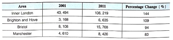
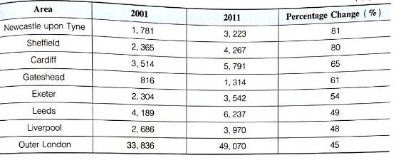
The table below shows changes in the numbers of residents cycling to work in different areas of the UK between 2001 and 2011.
分析:
这道表格题里包含了两个不同时间所对应的数据。如何对这12个地区的数据分段,并且进行适当的比较,是写好这道table题主体段的主要挑战。由于这12个地区的变化趋势都是上升,所以不能按数字上升的地区和数字下降的地区来对12个地区进行分类。
但仔细观察我们不难看出: inner London, Bristol 和outer London 这3个地区的骑车上班人数远多于另外9个城市,所以范文就选择了把这3个地区放在同一个主体段里介绍,而把人数比较少的其它地区放到另一个主体段里介绍。这样分类,不仅写起来更方便,而且也更充分地体现出了些较意识。:
主体段1:
It is clear from the table that the figure for cycling commuters increased significantly in each area between 2001 and 2011 (由于存在时间的变化,所以本段第1句概括了整体的变化趋势). Inner London had the most cycling commuters in both years("X"旬介绍具体数字时仍然是按照从高到低的排序,保持清晰的秩序感). In 2001, 43, 494 residents of inner London cycled to wok. This figure increased to 106, 219 in2011 (a 144% increase), which was much higher than (明显地高于) the percentage increase in the other areas. Over the same period, the number of cycling commuters in Bristol increased from 8.108 to 15.768 (an increase of 94%)。By contrast (比较),although outer London had the second largest number of people who cycled to work in each year (33, 836 in 2001 and 49, 070 in 2011), its percentage increase was the lowest of the twelve areas (45%)(指出增长率的最小值,同时合理地省略了一些非特征数字).
主体段2:
The other nine areas all had fewer than 10 thousand people cycling to work in 2001 and in 2011, but they also saw a significant increase in the number of cycling commuters over the 10-year period (类比数量上的区别和趋势上的相似之处). The area of Brighton and Hove saw the biggest percentage change of these nine areas (109%). The numbers of cycling commuters in Gateshead (816 in 2001 and 1, 314 in 2011) were the lowest of all the areas shown in the table (介绍特征值,对于非特征数据则同样不追求“面面俱到”).