柱状图(bar chart)实例
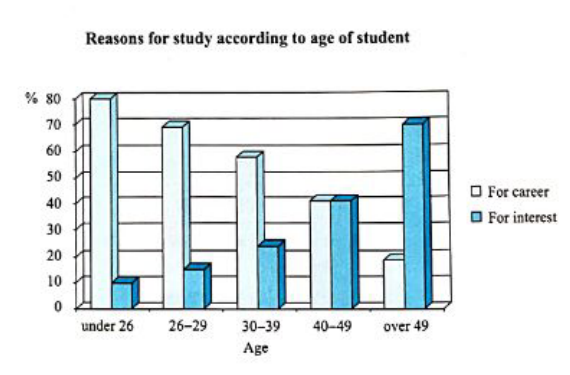
The chart below shows the main reasons for study among students of different age groups.
分析:
这道题里有study for career 和study for interest两类柱,可以各写一个主体段。如果bar chart里有时间推移。那么就按从左到右的时间顺序描述最清晰。请特别注意这篇8分范文是怎样介绍特征数据和明显的变化趋势,以及进行适当的对比和类比。
主体段1 (本段介绍study for career出于职业原因学习的人数占的百分比)
The bar chart shows that there is a gradual decrease in study for career reasons with age(因为本图里有年龄变化,所以第1旬选择了概括整体趋势:逐渐下降). Around 80% of students aged under 26 study for their career (特征点:起点),This percentage consistently declines as students get older (明显的变化趋势:持续下降). Only 40% of students aged between 40 and 49 and 18% of students aged over 49 study for career reasons (特征点:终点,注意26-29岁和30-39岁这两个非特征点的数据被合理省略了)。
主体段2 (考生在本段介绍study for interest出于兴趣学习的人数占的百分比)
By contrast (两类学生的趋势明显不同,所以是对比),study for interest increases with age(第1句概括整体趋势:随年龄逐渐上升). Only 10% of students aged under 26 study out of interest (特征点:起点)。This percentage increases steadily as students get older (明显的变化趋势:持续上升). The proportion of students in the 40 - 49 age group who study for interest is the same as (类出:相同的数据) the figure for those who study for career (around 40% ). However, 70% of students aged over49 (描述特征点:终止点) study tor interest, while (对比) only 18% study for career reasons in this age group.
对study for interest 的介绍也顺利、清晰地完成了,合理排序并且适当比较,就可以高效而且高质量地完成。
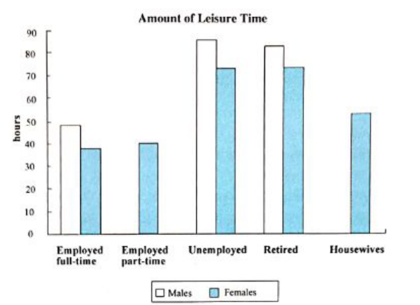
The chart below shows the amount of leisure lime enjoyed by men and women of different employment status in March, 2020.
分析:
当图形比较复杂时,应该先考虑怎样合理地对元素进行分类。怎样对这些看似“无厘头”的柱进行分类呢?
仔细观察这5组柱可以看出: 有两组柱( employed part-time 和housewives)只提供了女性的数据,却并没有提供男性的数据,跟另外三组柱有很明显的不同,所以可以把这两组特殊的情况单独放在一个主体段里来介绍,而把另外三组放在另一个主体段里介绍。在介绍具体的数字时,由于这个柱状图里没有出现时间变化,所以可以按照数字从大到小排序介绍。
主体段1:
We can see from the bar chart that in the employed full-time, unemployed and retired groups, men enjoyed more leisure time than women (本题是静态图,所以第1句就概括了这三组都是男性的休闲时间更多这个明显的整体特征) . The men in the unemployed group enjoyed the most leisure time (85 hours),while (对比) the women in this group only had 75 hours (由于是静态图,所以没有时间顺序,那么就严格按照数据从高到低介绍,形成了秩序感). In the group of retirees, males had 83 hours of leisure time, whereas (对比) females had 75 hours. The difference between the figures for males and females in this group (8 hours) was the smallest of these three groups (比较:这一组里男性数据和女性数据的差别是最小的). Women who were employed on a full-time basis had the least leisure time (38 hours) (休闲时间最少的一组). By contrast (对比),men who worked full-time had 48 hours of leisure time.
主体段2:
Only the figures for women are given for the groups of part-time employees and housewives, which show that female part-time workers and housewives had 39 and 52 hours of leisure time respectively.
由于bar chart的形式本身看起来就比较“呆萌”,所以当bar chart 数字很多的时候看起来会有点“烦人”。但是只要按照时间顺序或者按照数据从大到小的顺序并且进行适当的比较,再枯燥的bar chart也可以很快做完。
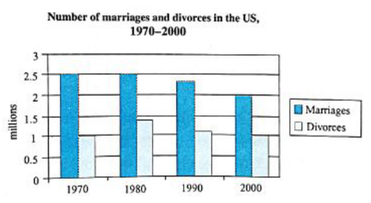
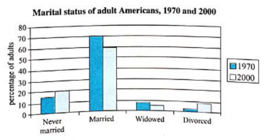
The charts below give information about US marriage and divorce rates between 1970 and 2000, and the marital status of adult Americans in two of the years.
分析:
坚信只要把主体段里介绍数据的顺序安排好,就肯定不会出现失控的局面。
主体段1:
Lt is clear from the first bar chart that the marriage rate in the US was significantly higher than the divorce rate over the 30-year period (第1句先对两类数据进行整体的比较). The number of marriages remained stable at (明显的趋势: 稳定于)2.5 million (绝不能写millions) between 1970 and 1980. while (对比) the figure for divorces increased (明显的趋势:上升) from1 million to 1.4 million over the same period. The number of marriages then gradually fell to 2 million over the following twenty years (明显的趋势:逐渐地下降,注意合理省略了1999年的非特征数据,不需要“面面俱到"). Similarly (类出,指出明显相似的趋势),the figure for divorces also showed a downward trend, reaching 1. 1 million in 1990 and 1 million in 2000.
主体段2:
The second bar chart shows that married people accounted for (占.... the largest proportion of the American adult population in both 1970 and 2000 (70% and 59% respectively) (第 1句概括了整体上哪一类数据是最大值). The percentage of adult Americans who were never married was 14% in 1970 and it increased to 20% in 2000 (介绍第二多的数值,排序介绍就一定会清晰). By contrast (对比), people who were widowed represented ( ....8% of the Us adult population in 1970 and the figure declined to6% in 2000. It is particularly noticeable that (尤其值得注意的是) although divorced people only constituted ..... 3% of the adult population of the US in 1970,in 2000 the figure was 9%,which means that the percentage of divorced Americans tippled over the period (对比:明显的倍数关系,增长了3倍)
Bar chart的规律性很强,只要真正掌握以上这些常规写法就够了。
快速解决“奇芭”的柱状图
分类提取法
小作文题库里还有少数“恐怖片儿”級的bar chart,需要用-种特殊的“分类提取法”来解决:
The chart below shows the total number of minutes (in billions) of telephone calls in the UK, divided into three types from 199—2002.
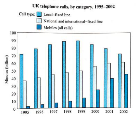
本题看似无从下手,如果只是老老实实地从左到右一列一列写,真有可能牺牲在考场上。但我们要活下去,而且要活得更好。其实只要仔细看图例,我们就可以看出这个“唬人”的图形就是含有三类元素(local fixed line all, national and international fixed line calls和mobile calls),完全可以对应提取出每一类元素,分别各写-一个主体段。在每一段的第1句概括该元素的整体特征,然后选择特征点写出来就好了,对于非特征点还可以理直气壮地省略。
满分实例
Local fixed line calls (在本段里提取出第一类元素: 固定市话的数据) were the highest throughout the period, rising from72 (70是离它最近的坐标值,72 其实是目测出来的估值) billion minutes in 1995 (特征点:起点) to just under ( 略低于) 90 billion in 1998. After peaking at 90 billion (特征点:最高点) the flowing year, these calls had fallen back to the 1995 figure by 2002 (特征点:终点).
National and international fixed line calls (本段提取出第二类元素:国内与国际固定电话的数据) grew steadily from 38 billion to 61 billion at the end of the period, though the growth slowed over the last two years ( 只介绍特征点和明显趋势,合理省略非特征点)。
There was a dramatic increase in mobile calls (提取第三类:手机通话的数据) from 2 billion to 46 billion minutes. This rise was particularly noticeable between 1999 and 2002,during which time the use of mobile phones tripled (对比,明显的倍数关系: 2002 年的.手机通话量变成了1999 年的3倍).
In conclusion, although local fixed line calls were still the most popular in 2002, the gap between the three categories ( 类别) narrowed significantly over the second half of the period (结尾段整体比较:尽管固定市话仍然是最流行的方式,但三个类别之间的差距在后半期明显地减小).